Sunday Times Graph Distortion
This is not, I repeat NOT, an exercise in conspiracy theorems. Nevertheless, The Sunday Times article on the crisis in the Union presented a graph which visually distorts a poll result on and independent Scotland’s financial prospects. Subtle as it might be, it has the power to affect people’s judgements.
The Scottish Constitutional debate is a passionate one, and it engages people from all walks of life. Politicians, the public, and academia are all involved. Media is also involved. It isn’t a surprise to learn that a lot of the media is partisan. In a democracy, that is healthy and should be taken as a sign of democratic strength. Freedom of speech is vital, and I would never decry any publication for taking a particular editorial stance on a subject. Least of all about Scotland’s constitutional future.
But, as I’ve written about before, accuracy and facts are important. Subtle distortions can influence in wider way than one might think. If you don’t believe me, you just need to look at how an obscure post on a conspiracy theory laden website has taken hold of people in United States with consequential effects.
One of the things I have learned as a journalist and studying history at University is to verify information myself. To look and double check that something is accurate. Scepticism can sometimes allow you to see things that could otherwise be missed. That is how I managed to spot something a little bit odd in a graph that appeared with The Sunday Times article ‘Union in crisis as poll reveals voters want referendum on Scottish independence and united Ireland’ from Sunday 24th January 2021. The report featured several graphs visualising poll results. These graphs were all interesting, but this one caught my eye.
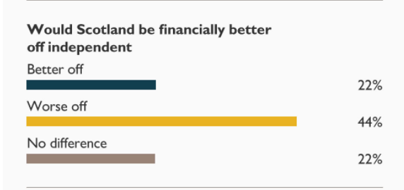
Finances of an independent Scotland are a hotly contested topic. I’m not here to argue on that debate. The purpose of this piece is to highlight something that somewhat troubled me. You see, to my eye something looked off. Looking at the graph “Worse off” looks far ahead. It is after all backed twice as much as “No difference” and “Better off”. But what we have here is a distorted graph. Let me demonstrate. If I take the 22% bar from “No difference” and combine it, end-to-end, with “Better off” we get a total of 44%. But strangely this 44% is not equal to the 44% for “Worse off”.
There can be no doubt that that right there is a distorted graph. Whether deliberate or an honest mistake, it makes “Worse off” appear more supported when it compares to “No difference” and “Better off” combined. Some might scoff and think “Well that’s not a big deal, it doesn’t mean anything really, the numbers are there”, but that is wrong. Studies have shown that graph distortion does have an impact, even when numbers are included.
The following is an excerpt from a study published in 2014 called, ‘Measurements of mislead threshold of company graph distortion’.
“Graphical information is one of the critical types/formats of information. If the graphical information cannot be kept with its correctness, the people’s judgments will be affected by distorted graph and so, the information quality will be destroyed.”
This sums up the importance of why distorted graphs matter. If people are going to make judgements on Scotland’s financial future, then they deserve to have those judgements properly represented. Equally, if people are to be presented with visual representations of the responses, then they too deserve to view them correctly. People are influenced by the opinions of others and the visual distortion can influence the strength of opinion regarding “Worse off”. Little by little, small pieces of misinformation and subtle manipulations, whether deliberate or otherwise, undermine the truth.
People might say: “It is just one graph and it isn’t a big deal”. They may well be right, it isn’t going to break the internet, but it is still worth pointing out. The idea here isn’t to influence wild conspiracy thinking about evil media corporations or sinister Unionist misinformation campaigns. The point is that critical thinking is important, especially in this post-Trumpian world where tens of thousands of lies or misleading information have the power to, little by little, erode where we believe is the bar for truthfulness and accuracy sits.
To anyone who dismisses this example as unimportant I would ask them to bear in mind that we don’t view one wave crashing on a rock as playing a role in coastal erosion, but we know that it does.
Obviously, this graphical representation is helpful to one side of the independence debate more so than the other. We know that The Sunday Times is likely to have a more Unionist readership than pro-independence, but we shouldn’t discount the fact that these graphs have been shared widely on Social Media. This means that soft Yes voters, undecideds and soft No voters may well have seen these and have their judgements affected by the distorted graph, no matter how subconsciously.
I asked The Sunday Times for comment regarding this story. Despite correspondence with their Press Office, they have not provided any comments at the time of publication.
We are supported only by our readers. We don't have corporate backers and we don't take advertising, so we rely entirely on your support.
Help to support independent Scottish journalism
I’d like to understand the mindset of that 44%. It would be pretty hard to be worse off than we are now, in the medium and long term anyway – albeit short term would be uncertain.
Are statistics wonderful?
22% + 44% + 22% = 88% (not 100%)
If we assume the missing 12% is the “Don’t know or won’t say” respondents, we can construct an entirely different headline.
“Only a minority (44%) thinks that Scotland would be worse off”.
Maybe it will be North Sea oil revenues that saves us, maybe it will be a Scottish National Lottery, who knows?
I sent an email to complaints at the Sunday Times re distortion. Hope all do likewise. Thank you for spotting this. Just received an email from Steve Bleach asking me to specify the graph. Please send him a complaint..I’m sure he’s feeling needy.
I am familiar with some of the work of Edward R Tufte, on which the linked study seems to draw. On the question of an allegedly “Misleading graphic in the New York Times”, Tufte has this response:
https://www.edwardtufte.com/bboard/q-and-a-fetch-msg?msg_id=0000Uz
I have worked with business reports and web-based vector graphics, where graphs tend to be either fully or semi-automated, their relative proportions calculated rather than hand-drawn. However, it is Tufte’s comments on the expectation of that a newspaper would have a graphic house style and an in-house reputation for accuracy to maintain that are especially interesting here. He would be more critical if the graph was created by the in-house team than by an outside contractor, it seems. Worth knowing which it was, then.
My view is that for transparency and integrity, a major media organization should publish its graphical style guide, including detailed requirements for figures and quantitative accuracy. Casting around for examples, I note that Eurostat publishes their freely-accessible graphical style guide online, including bar charts (although they do not mention accurate representation of proportion, as far as I can see: perhaps that is taken for granted).
As for the minimalist guidance in my copy of New Hart’s Rules, 16.3.5 Graphs, a consistent scale is mandated with their example bar chart showing increments along an x-axis, something lacking in the Times example (which would have highlighted the distortion or discrepancy one way or another).
Prof John Robertson pointed out another distortion on his website here:
https://talkingupscotlandtwo.com/2021/01/24/the-scale-of-deception/
This too distorts against the Yes side.
When you think that during the US Georgia Senator election, earlier this month, the Republicans photoshopped Sen Jon Ossoff’s nose (he is Jewish) to increase its size and thereby attempting to capture votes from the right wight (bigoted) electorate, it’s not just graph manipulation we need to watch out for.