Self-Determination, Autonomy, Independence
Today we are launching our updated new website. Our fresh look has been brewing for a while and will coincide with a few other changes. We have improved navigation and moved to dedicated servers to offer better protection against the sort of DDoS attacks we were experiencing.
The thinking behind the new look is described by the designer as follows:
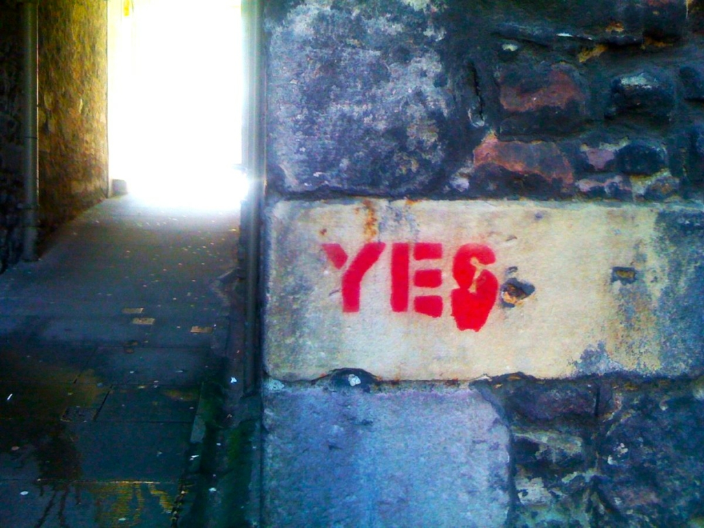
“The new Bella Caledonia identity is simultaneously a break with convention and a reinforcement of the independent spirit so vital to the publication. The logo’s inspiration is drawn from the imagery Alasdair Gray describes of the Bella character being attached to two bodies (one by a neck longer than the body itself, and the other, much stronger body, by a shorter neck). This led to the idea of a conjoined entity being separated into its constituent parts, with each part able to function independently – something visualised by a red backslash we call the “break” or “rupture”. We also wanted to convey a sense of positive movement in the logo design, with the stronger/bolder word ‘Caledonia’ revealing itself from behind the backslash. The chosen fonts hark back to the Alasdair Gray designed lettering of the first logo, with a modern evolution in the contrast between the light and bold font weights, while the high impact primary colour scheme is drawn from rebellious, counter-culture movements.”
Alt Shift
The site still has all the functionality and a back-catalogue of fourteen years publishing. But politically we are shifting focus to include more coverage of Scottish politics as we enter both the prospect of a referendum and unfolding constitutional crisis/possibility, and a more critical edge on the failures of our own political leaders.
This is a tension not a contradiction. We both demand a future Scottish democracy and better Scottish government now. The two are inseparable. We will also be focusing more and more on the wider issues of social and ecological collapse, as the realities of Tory Britain, Brexit and climate change converge bringing: mass poverty; the NHS on its knees due to lack of staff; water shortages and resource wars; agriculture and fishing crisis; deep problems in access to housing; soaring food prices and exorbitant energy costs. All of this emerges in the context of a British state whose political leaders (of all stripes) offer solutions which are inadequate, short-term or ameliorative; and completely lacking in recognising the scale and depth of the predicament we face.
We live tied to a janus state which combines a new authoritarianism and a complete disinterest in acting on social crisis. On the one hand they will repress and criminalise those involved in any protest – on the other they call alleviating the worst economic conditions in decades ‘handouts’. The contempt is complete and universal.
The fresh design reflects this new landscape where things are darker and more urgent and where the crisis has intensified. Gone are our primary colours. The design reflects the idea that radical change is urgent, that independence is rupture not some seamless managerial process, and that departure from the UK is an act of urgent self-defence not just an expression of sovereignty. As Rishi Sunak and Liz Truss sneak into Scotland to hide behind tight security and speak a message denigrating Scotland to an audience far away we again call for self-determination, autonomy and independence.
We hope you like the new look and will leave you to explore some of the new features and refinements. Thanks to everyone who has supported us in the past month, and big thanks to the team who worked on the new site.
We are supported only by our readers. We don't have corporate backers and we don't take advertising, so we rely entirely on your support.
Help to support independent Scottish journalism
Good luck with the new look!
I take it that I dont have to re-subscribe
Thanks David, no, no need to
A much cleaner look. Very welcome.
Seems like a lot of verbage about a vaguely pretend-corporate cheapskate logo you can churn out on Word for Windows and paste in Acrobat in about two minutes.
Lovely. Thanks.
The red stripe reminded me of face paint, like in Pat Mills’ Celtic warrior Sláine. Apparently the Italian footballers of Serie A wore similar stripes (or slashes, or scars) of facepaint as part of a campaign to protest domestic violence against women. Initial impressions are that the new layout is slightly more readable.
I miss Bella.
Also, not too sure about the red/green/black combo. From a usability perspective I was always taught to avoid colours that were on the spectrum for colour blindness when providing visual cues.
Good luck with the renewal.
I think there is a need to recognise that a ” better Scottish government” can ONLY be realised by securing the powers of Independence.
If this is what you support then you must also support the current Scottish government that is actively enabling a path to Independence.
Support it by engaging more people to choose Independence. Engage them by describing the different citizenship, choices and influence they can have over the realities in their own lives and own areas by living in an Independent Scotland. Inspire them to take responsibility to become involved and make change happen. Energy , time and space spent on a ” more critical edge on the failures of our own political leaders” will in NO way support the change you aspire to , instead it will undermine confidence, distract from the positive alternative future and retain the agenda on the current interminable debates that those who oppose change so desperately want to perpetuate in the absence of any solutions or vison.
Those of us able and willing to inform, motivate and inspire our fellow citizens to choose Independence have over a million people to convince to secure that change is the settled will of 2 out of 3 of our fellow citizens and that they are ready to become involved in building a better nation.
This relaunch is an opportunity to use your platform to plant the seeds of change in every community, make the conversation about what the future can become and set the tone….if you can’t do it, no one can!
Hi Alex – 100% agree that ‘ a “better Scottish government” can ONLY be realised by securing the powers of Independence.” Bit I think being completely uncritical of our current governance does not serve the cause of independence and is incompatible with independent media.
I completely agree that “This relaunch is an opportunity to use your platform to plant the seeds of change in every community, make the conversation about what the future can become …” and that is our aim. Thanks for your comment and feedback.
Agree about your point, but since even the current Scot Gov. don’t seem interested in better Scottish governance, then they must remain open to criticism and being held to account.
Think of all the excellent policy work done by Common Weal and how actively it is ignored and dismissed by the SNP. How the grass-roots “Yes” activism is left unsupported and un-encouraged by Bute House. The SNP are the vehicle, not the destination.
” They tried to bury us. They didn’t know we were seeds…”
Off a badge bought at an indy march yonks ago but still relevant.
Like the new look and wish Bella all the best.
Agree that conversations in our communities are vital to boosting confidence, creating mutual understanding and solidarity, and moving toward Independence.
Thanks Babs
I think its eye catching. The diagonal red when not joined up to the title makes me wonder, then go ah! ANyway I like straight forward uncluttered. But I hope the Bella female figure hasnt gone away.
Thanks Cathie – no the Bella figure will still be used on some our merch and marketing. cheers, Mike
Cleaner, sharper look and easier to read and navigate. Well done.
I’m not sure about the red/black colour combo ( puts me in mind of Pink Floyd’s proto-fascist marching hammer emblem from “The Wall”). It seems to be a “no more mr-nice guy” message…..maybe that’s fitting for our times.
Thanks Wul – yes to the No Mor Nice Guy take – tough times ahead so we’re sharpening up our outlook and our look : )